Tessera Viz
PX-02
Tessera UI
The rest of the screen, already built.
Form fields, dialogs, menus, tabs, cards and dashboard tiles that match your charts, because they read the same theme. 55 components free; advanced widgets in Tessera UI Pro.
01
What it is
06
Tessera UI
Your charts are done. The screen around them shouldn't take another quarter.
Every dashboard needs the same parts around the charts: filters, forms, dialogs, tabs, tiles. Built separately, they take weeks and never quite match. Tessera UI ships them ready-made, in the same theme as the charts, so the whole screen looks like one product.
55
Free components
36 KB
Gzipped, all 55
0
Runtime dependencies
02
See it
06
Try it yourself.
Three real screens made only of the free parts: a sign-in form, a new-client form and a small dashboard. Submit the forms empty, add a client, switch the dashboard's period, then change the look and watch every part follow.
Look
Accent
Corners
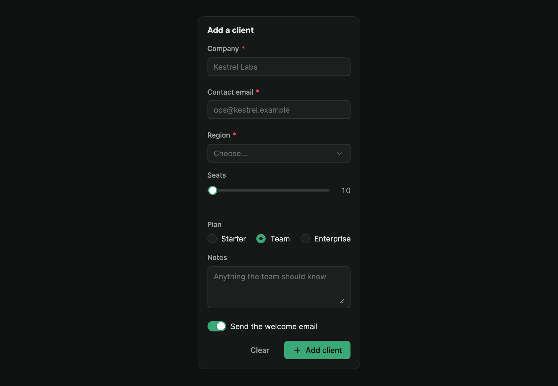
A form with a text area, a choice of plan, a seat slider and a switch. It shows what was entered when it is sent.
Loading the demo…
Made of
tx-form
tx-text-field
tx-select
tx-radio-group
tx-slider
tx-switch
tx-textarea
tx-button
Submit empty
Fields explain what is missing
Dashboard
Search, and switch the period
Look
Site, dark or light
Accent
One token, every part
Free parts
Live, with a Customise panel
Pro widgets
A picture and what Pro adds
Code
Properties, events, keys
Every control on these screens is a Tessera UI part. In the site look they take this site's colours by setting theme tokens; the product's own dark and light are one switch away. The clients are made up.
03
What's in it
06
55 parts free. 19 more in Pro.
Every part, grouped the way a screen is built, free and Pro pictured the same way. Open one for the live part (a picture for Pro), its code, properties, events and keyboard use. Options, tabs and menu items are drawn inside the part they belong to.
Loading the demo…
04
How it works
06
How it fits into your app.
01
One theme for the whole screen
The parts read the same kind of tokens as the charts. Set the accent, corners or fonts once on a container, and everything inside it follows; a light or dark area is one attribute.
02
Any framework
They are standard web components. Plain HTML and React are tested; Vue, Angular and Svelte use custom elements as they are.
03
Real forms
The fields join a plain HTML form: form data, reset, disabled sections and the browser's own validity check all work.
04
Keyboard and screen readers
Keyboard use and screen-reader roles follow the WAI-ARIA patterns, tested with a real keyboard in a real browser. Right-to-left is supported too. No WCAG certification is claimed.
05
Nothing fetched
No fonts, icons or data are downloaded by the parts, and your page's CSS cannot break them: each draws in its own shadow DOM.
06
Install
From the developer kit: npm install ./packages/tesserify-ui-0.8.0.tgz, then import "@tesserify/ui" once.
05
Where it stops
06
What it won't do yet.
01
The advanced widgets
Date and range pickers, a colour picker, smart selects, the query and form builders, a drag-and-drop dashboard, a command palette, tree view, transfer list, file drop and a notification centre are in Tessera UI Pro.
02
A design tool
It is code you put in your app, themed with tokens. There is no visual page builder.
06
Where next
06